Physical Address
23,24,25 & 26, 2nd Floor, Software Technology Park India, Opp: Garware Stadium,MIDC, Chikalthana, Aurangabad, Maharashtra – 431001 India
Physical Address
23,24,25 & 26, 2nd Floor, Software Technology Park India, Opp: Garware Stadium,MIDC, Chikalthana, Aurangabad, Maharashtra – 431001 India
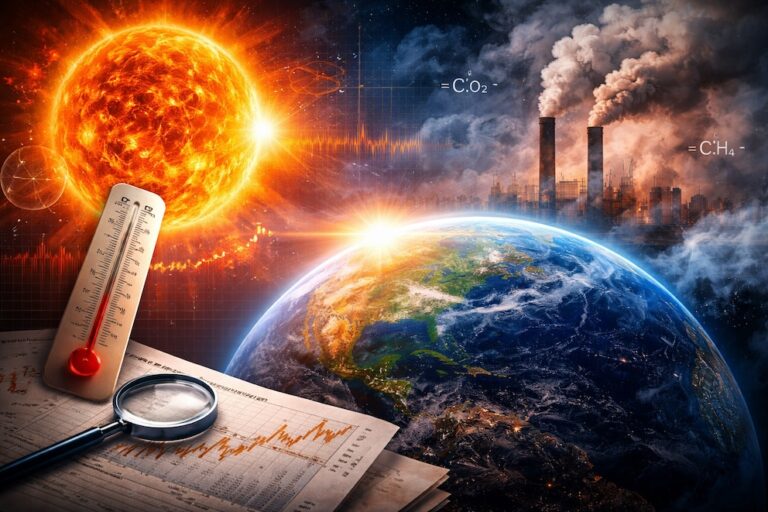
NASA has once again captivated the scientific community and the public with a groundbreaking visualization tool that vividly illustrates how carbon dioxide (CO2) circulates across our planet. This tool provides a mesmerizing, animated depiction of global CO2 concentrations, highlighting the intricate movements of this critical greenhouse gas and its profound impact on Earth’s climate. The visualization, featured in a recent NASA YouTube video, offers a fresh perspective on CO2 emissions and their global distribution, bringing to light the complexities of Earth’s carbon cycle.
India’s CO2 Emissions: A Stark Visual Reality
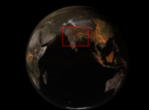
One of the most striking revelations from NASA’s visualization is the depiction of CO2 emissions over India. The animation showcases vibrant orange plumes of CO2 that rise from India and swirl across the globe. These plumes, representing areas with CO2 concentrations between 420 and 460 parts per million (ppm), starkly illustrate the extent of emissions in the region. The visualization underscores how CO2 emissions in India are not just a local phenomenon but part of a larger, interconnected global pattern, with emissions transported from neighboring regions and continents.
Further, NASA scientists explain that the CO2 plumes observed over India are generated by a mix of sources, including power plants, industrial activities, transportation, and urban areas. India’s reliance on coal as a primary energy source significantly contributes to these emissions. The visualization also highlights the impact of emissions from neighboring countries and regions, reinforcing the idea that CO2 knows no borders, and that India’s carbon footprint is both a local and a global concern.
A Closer Look

Picture courtesy: International Energy Agency (IEA), India
Moreover, the animation reveals a pulsing effect in the CO2 plumes over India, which can be attributed to several factors, including the day-night cycle, plant photosynthesis, and the daily fluctuations in the planetary boundary layer (the lowest part of the atmosphere). During daylight hours, as the Earth’s surface warms, the boundary layer rises, leading to an increase in CO2 concentrations. Conversely, at night, the boundary layer falls as the surface cools, resulting in a temporary decrease in CO2 levels. This dynamic interplay highlights the complexity of CO2 distribution and its relation to natural processes.
Experience the mesmerizing pulsing of CO2 emissions as they spread across the globe in this stunning visualization from NASA’s Scientific Visualization Studio. See how CO2 levels rise and fall over time, revealing the dynamic nature of Earth’s atmosphere. Download the full visualization here: https://svs.gsfc.nasa.gov/5196 Credits: NASA’s Scientific Visualization Studio.
India ranks 7th in the Climate Change Performance Index (CCPI) this year, 2024, reflecting its strong performance in greenhouse gas (GHG) emissions and energy use categories. Despite its low per capita emissions, India remains heavily reliant on coal, which contributes significantly to its greenhouse gas emissions. Experts urge India to accelerate its renewable energy adoption and phase out coal faster to achieve more ambitious climate goals. Read more
Global Implications and the Path Forward
The data used to create this visualization were gathered from various satellite instruments, including the Terra satellite’s MODIS and the Suomi-NPP satellite’s VIIRS instruments. These instruments provide critical information on atmospheric conditions, helping scientists understand the movement and density of CO2 across the globe.
Lesley Ott, a climate scientist at NASA’s Goddard Space Flight Center, emphasized the importance of this visualization in understanding the impact of human activities on climate change. “We can’t tackle climate change without confronting the fact that we’re emitting massive amounts of CO2, and it’s warming the atmosphere,” Ott said. The visualization underscores the urgency of addressing CO2 emissions, which have reached unprecedented levels in recent years, contributing to the hottest year on record in 2023.Therefore, this visualization tool not only provides valuable insights into the current state of Earth’s atmosphere but also serves as a powerful tool for predicting future CO2 levels and their impact on global climate patterns. By enhancing our understanding of the carbon cycle, NASA’s CO2 visualization tool is a critical resource for scientists, policymakers, and the public as we work towards mitigating the effects of climate change.